
By Rachel Opperman
Accessible Drag-and-Drop in Vue

At first glance, building an accessible web application may not seem too difficult — use semantic HTML and be conscious of your design decisions and you can be a good part of the way there.
However, maintaining a high level of accessibility can be challenging sometimes, especially when the application has features that require a lot of user interaction.
Drag-and-drop is a perfect example of such a feature, and it's one that may seem like it can't possibly be accessible. But actually, it doesn't take too much extra code to make a drag-and-drop component that can be used by screen reader users and/or keyboard-only users!
In this post, we'll discuss the accessibility issues that are found in "normal" drag-and-drop components and the functionality that needs to be added to make them accessible. Then we'll walk through how to build an accessible drag-and-drop component in Vue.
Drag-and-drop accessibility issues
The phrase "drag-and-drop" suggests that it's a feature that requires a couple of things. First, the user must be able to visually perceive the elements on the screen to (a) know that drag-and-drop is possible and (b) select a specific element and drag it to a certain area. The user must also be able to see the order of the draggable elements, as well as any specific "drop zones". Second, the user must have the ability to use a mouse or trackpad (or a finger, in the case of a mobile device) to relocate the elements.
If those two things were actually required, then a large number of users would be completely prevented from using a drag-and-drop feature, which means that the feature would have very poor accessibility. However, by adding a bit of extra code, we can ensure that those "requirements" aren't requirements at all, and we can guarantee that all users can make use of the feature.
Functionality to add
To make drag-and-drop accessible, we need to do the following:
- Add some text that will indicate that drag-and-drop is possible and provide directions for using the feature.
- Ensure that the draggable elements (and any drop zones) are keyboard focusable.
- Add event handlers for grabbing, moving, and dropping elements.
- Add text, which will only be visible to a screen reader, that will provide information about the elements on the page as the user grabs, moves, and drops them.
This may sound like a lot, but it doesn't require too much extra code, and the result will be a drag-and-drop feature that anyone can use.
Building an accessible drag-and-drop Vue component
Note: This component makes use of the vuedraggable package. Please see the package's documentation for the specifics of its implementation, as the explanation of such is beyond the scope of this post.
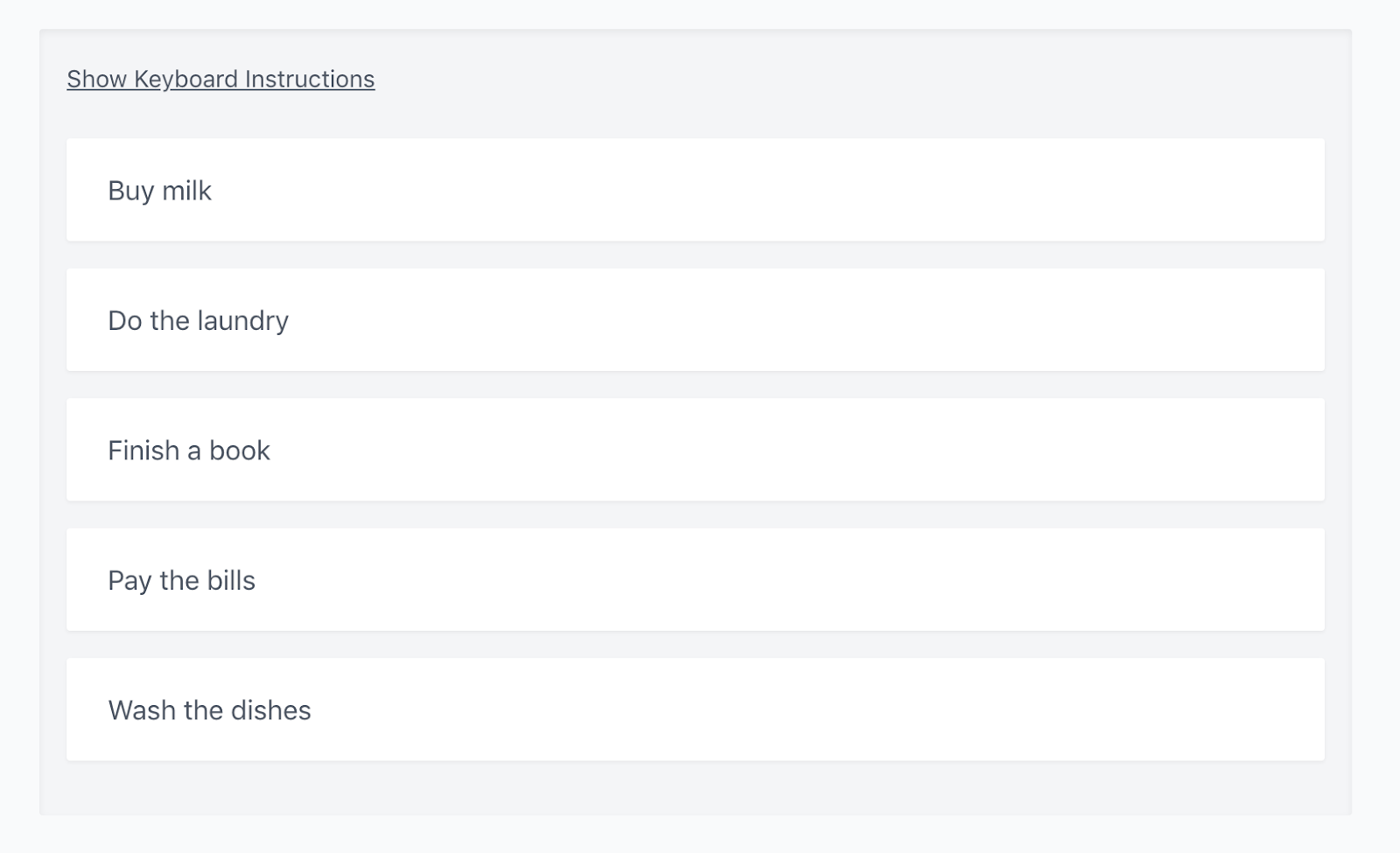
In this tutorial, we'll build a simple to-do list that contains a few preconfigured items that can be reordered.
Providing context to a screen reader user
The first thing that we need to do is add content to the page that will let a screen reader user know that the page contains a list of to-do items that can be reordered, as well as the purpose/result of reordering the items. In this example, the explanation is visible to all users, since a small amount of context is useful to every user.
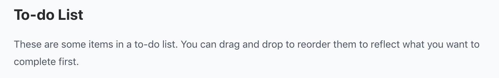
<h2 v-text="'To-do List'" />
<p v-text="'These are some items in a to-do list. You can drag and drop to reorder them to reflect what you want to complete first.'" />
Providing instructions for using the feature with a keyboard
Eventually, we'll have a component that contains a list of draggable to-do items, as well as a section at the top that enables showing and hiding keyboard instructions. We'll return to the individual items later.
First, we need to add some content to the component that is only visible to a screen reader. This content will contain instructions for using the drag-and-drop feature, as well as informational text that gives live updates to the user as the items are grabbed, moved, and dropped.
<div
  id="reorder_instructions"
  class="sr-only"
  v-text="'Select a todo item, then press the spacebar to reorder.'"
/>
Let's walk through this code:
id="reorder_instructions": Thisidwill be used by the individual to-do items in order to tell a screen reader what the items are described by (more on this later). You can use any value you'd like here — it doesn't have to bereorder_instructions.class="sr-only": This is a Tailwind class that will visually hide the element because it's not necessary for sighted users. You can learn more about the class in the Tailwind documentation.- The
v-textprovides a simple explanation that will be announced by the screen reader. We'll provide more specific directions for using the feature in the next piece of code.
Next, we'll provide an area for the assistive text that will be updated as the list is reordered.
<div
  aria-live="assertive"
  class="sr-only"
  v-text="assistiveText"
/>
There are two important things to note about this element:
aria-live="assertive": Thearia-liveattribute is used to announce dynamic changes, since a screen reader user is unable to see how the content of the page is changing. The value ofassertiveresults in the changes being announced immediately, rather than only when the user is idle. By adding this attribute, we ensure that the user is notified as soon as the list is reordered. You can read more aboutaria-liveon MDN.v-text="assistiveText":assistiveTextis going to be a localdatavalue that will be updated accordingly as items are grabbed, moved, and dropped.
Finally, we need to provide some instructions to a keyboard-only user — someone who can see the contents of the page, but can't use a mouse or trackpad.
<div>
  <button
    type="button"
    @click="showKeyboardInstructions = !showKeyboardInstructions"
    @keydown.enter.prevent="showKeyboardInstructions = !showKeyboardInstructions"
    v-text="keyboardInstructionsButtonText"
  />
  <p
    v-if="showKeyboardInstructions"
    v-text="'Select a todo item, press the spacebar to grab it. Press the up and down arrows to change position, then the spacebar to drop.'"
  />
</div>
This button will toggle the visibility of the <p> element by setting the value of showKeyboardInstructions, which is initialized to false. Note that a specific Enter key handler isn't necessary on a <button> element, but it's good practice to provide one. keyboardInstructionsButtonText is a simple computed property that will change the text from "Hide Keyboard Instructions" to "Show Keyboard Instructions" depending upon the value of showKeyboardInstructions.
Creating the list
Now that we have all of the necessary context and instructions in place, we need to create the list of items.
<Draggable
  v-model="todos"
  :animation="100"
  tag="ol"
  role="listbox"
>
  <TodoListItem
    v-for="(todo, index) in todos"
    :key="todo.id"
    :index="index"
    :todo-item="todo"
    @itemGrabbed="handleItemGrabbed($event)"
    @itemDropped="handleItemDropped($event)"
    @moveItem="moveItem($event)"
  />
</Draggable>
Note that the Draggable component is given a tag value of ol. An ordered list is used because the items in the list of to-dos are meant to be in a specific order. The role of listbox is added because it provides some useful keyboard and screen reader functionality. You can read more about listbox on MDN.
todos is an array in the component's data, each element of which is an object that has a unique ID and a text value (e.g., "Buy milk"). The three custom events on the TodoListItem component will make more sense once we write that component, which we'll do next.
Creating the list item
The template for the TodoListItem component is small and relatively simple.
<template>
  <li
    role="option"
    draggable="true"
    aria-describedby="reorder_instructions"
    tabindex="0"
    class="todo-list__item"
    @keydown.space.prevent="toggleGrabbed"
    @keydown.down.prevent="moveItem(true)"
    @keydown.up.prevent="moveItem(false)"
  >
    <p v-text="todoItem.text" />
  </li>
</template>
Each item in the list is an <li> element that contains a <p> element with the to-do item's text. Let's walk through the attributes on the <li> itself.
role="option": Each child of alistboxmust have theroleofoption.draggable="true": This indicates that the element can be dragged.aria-describedby="reorder_instructions": This lets assistive technologies know which element describes the<li>. In this example, that element is the<div>with the basic instructions that we added to the parentTodoListcomponent.tabindex="0": An<li>is not inherently keyboard focusable, so adding atabindexof0will allow each to-do item to be focused by a keyboard user.class="todo-list__item": This is a custom class that is used for styling, but it also serves a purpose in refocusing an item once it's been dropped (more on this later).
The key handlers for Space and the up and down arrows call methods that result in emitting specific events with specific payloads. These events (and their payloads) will be received by the parent TodoList component, which is where the actual functionality of reordering the list will occur. You can view the TodoListItem event handlers here. The most important thing to note about these methods is that they pass along necessary information about the to-do item's list position, as well as the item itself, to the parent component.
Handling list reordering
You'll recall from a previous section that the parent TodoList component is listening for three specific events:
<TodoListItem
  v-for="(todo, index) in todos"
  :key="todo.id"
  :index="index"
  :todo-item="todo"
  @itemGrabbed="handleItemGrabbed"
  @itemDropped="handleItemDropped"
  @moveItem="moveItem"
/>
These events trigger event handlers that take care of grabbing, moving, and dropping a to-do item via the keyboard. We'll walk through them one at a time.
handleItemGrabbed
This method is responsible for "grabbing" an item via the keyboard — it's the equivalent of clicking and holding with a mouse or trackpad.
handleItemGrabbed({ todoItem, index }) {
  this.assistiveText = `${todoItem.text}, grabbed. Current position in list: ${this.getItemPosition(index)}. Press up and down arrows to change position, spacebar to drop.`
}
The method receives the todoItem and the index from the TodoListItem component, and then uses them to update the assistive text that's announced to a screen reader user. The assistive text lets the user know which item is grabbed, its current position in the list, and how to move it to a different place in the list.
getItemPosition is a method that returns a string with the current position of the item, for example, "1 of 5".
moveItem
This method is the most complex of the three, and it's responsible for moving the selected item to a different position in the list. It's the equivalent of dragging the item to a different position with a mouse or trackpad.
moveItem({ dragIndex, hoverIndex }) {
  // Make sure the new position isn't out of bounds
  if (hoverIndex < 0 || hoverIndex >= this.todos.length) {
    return
  }

  // Make a copy of the existing list & find the item that's being moved
  const todosCopy = this.cloneDeep(this.todos)
  const draggedItem = todosCopy[dragIndex]

  // Remove the item that's being moved
  todosCopy.splice(dragIndex, 1)

  // Place it in its new position
  todosCopy.splice(hoverIndex, 0, draggedItem)

  // Update the list of todos to reflect the new order
  this.todos = todosCopy

  // Update the assistive text announced to the screen reader user
  this.assistiveText = `${draggedItem.text}. New position in list: ${this.getItemPosition(hoverIndex)}`

  // Wait for the DOM to update, then find all list items & focus the one that was just moved
  this.$nextTick(() => {
    const items = [...document.getElementsByClassName('todo-list__item')]

    items[hoverIndex].focus()
  })
}
The dragIndex is the item's current position in the list, whereas the hoverIndex is the item's new position in the list (i.e., where it's being moved).
First, we check that the item's new position is valid. If it isn't, we exit the method. Next, we make a copy of the existing list. This may not be strictly necessary for such a simple example, but if you're working with data from a Vuex store instead, you'll likely need to copy the list to avoid mutating state outside of a mutation, so the cloning is included here to provide an example for that kind of use case.
We then find the item that's being moved, remove it from our list copy, and then place it in its new position. We can then update todos to reflect the new order (this is where a mutation would be called if the list was coming from Vuex state). Once the list has been updated, we update the assistive text to let a screen reader user know which item was moved and what its new position is.
Finally, we wait for the DOM to update, and then we find all DOM elements with the class of todo-list__item — this is why we gave the child component <li> a specific class. We then find the item that was just moved (using its new position, since the order has been updated at this point) and focus it. This is done so that we maintain keyboard focus on the correct element, allowing the user to easily move the item again or trigger a drop event.
handleItemDropped
This method is responsible for "dropping" the selected item and allowing the user to select another item. It's the equivalent of ending a mouse or trackpad click after an item has been dragged to a new position.
handleItemDropped(todoItem) {
  const index = this.todos.findIndex(todoToFind => todoToFind.id === todoItem.id)

  this.assistiveText = `${todoItem.text}, dropped. Final position in list: ${this.getItemPosition(index)}`
}
First, we find the index of the specific to-do item so that we know its final position after being moved. Next, all we have to do is update the assistive text to let a screen reader user know which item has been dropped and what its position in the list is now.
Wrapping up
So there you have it — a drag-and-drop feature that doesn't require the use of a mouse/trackpad or even the ability to visually perceive what's on the page. By adding just a few extra methods, event handlers, and HTML elements, we were able to ensure that using drag-and-drop isn't exclusive to the users that don't need assistive technologies or that fall inside the narrow range of "normal" users. Including these additions just goes to show that all it takes to make the web accessible to all is putting in a little extra time and effort as we build sites and applications. Given the huge impact it can have, it's well worth it.
Looking for a web development partner? Zaengle is the preferred development team for a number of businesses and organizations, large and small. We'd love to connect and see how we can help you.

By Rachel Opperman
Engineer
What happens when you cross years of study in biology and medicine with a degree in computer science? You get someone like Rachel.


