By Rachel Opperman
Designing for Accessibility

Many aspects of web accessibility are implemented through code, but code isn't the only thing that matters.
A website's design plays a crucial role in ensuring people with disabilities can use the site effectively.
Failures in design can lead to a variety of accessibility issues — no matter how much effort goes into meeting standards in the code. In this post, we'll discuss a few aspects of a website's design that can help ensure the site is accessible to all users.
TL;DR
- The following are some of the items we pay close attention to at Zaengle:
- Make sure text and interactive elements have a color contrast ratio of at least 4.5:1.
- Avoid using color alone to convey information.
- Place meaningful text inside of links.
- Try to avoid parallax scrolling and flashing graphics or animations.
- Align text to the left, and take note of line length and spacing.
- Avoid using flattened text within images when possible.
Ensure acceptable color contrast ratios
Users with low vision can have trouble reading text without enough contrast between the text and the background, which is why the Web Content Accessibility Guidelines (WCAG) specify minimum contrast ratios. The WCAG 2.1 minimum contrast ratio for most text is 4.5:1. Text that is at least 18 point or 14 point bold has a minimum contrast ratio of 3:1.
Let's look at an example.
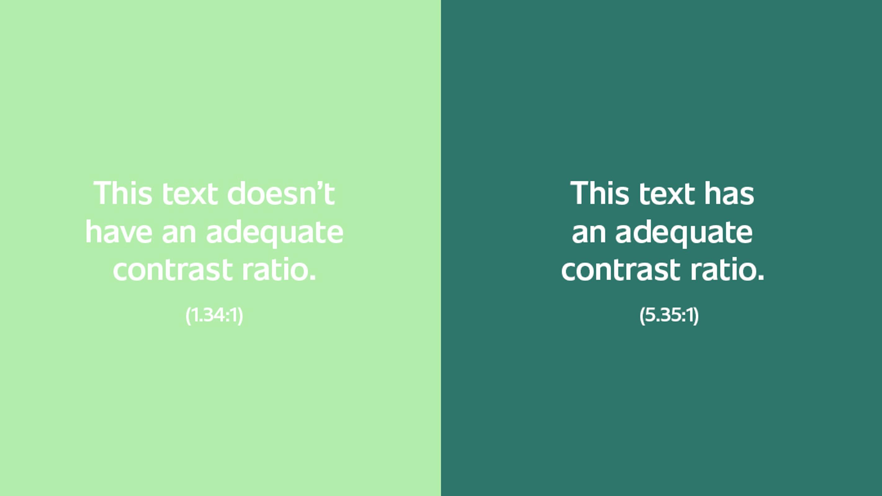
The text with a contrast ratio of 1.34:1 is difficult to read, even for users without color vision deficiencies. This is a perfect example of how creating a design with accessibility in mind will benefit all users.
Adequate text contrast is particularly important for branding colors, since those are often difficult to change later. There are many contrast checkers out there, but an excellent one is the WebAIM contrast checker. Checking text contrast while creating a design will verify the site's text can be read by users with color vision deficiencies.
Use multiple indicators to convey information
Since some users have difficulty perceiving color, it's important to use additional indicators besides color to convey information. For example, required fields in a form are often indicated with red label text. But another indicator should also be used, such as an asterisk next to the label text.
Another good example is the active navigation item. Instead of using only a different color to indicate the item is active, add another indicator, like a bottom border. In this example from Workify, the active navigation item has green text and a bottom border, while the inactive items have white text and no bottom border.

Place meaningful text inside of links
A link's text indicates its purpose, so it's important to place meaningful text inside of links. For example, "click here" and "read more" aren't useful to certain users. A screen reader provides a list of links on a page, and a list consisting of nothing but "click here" and "read more" is useless to a screen reader user. People with cognitive limitations could become disoriented by extra navigation to and from content in which they're not actually interested.
Imagine a site has a page with the content "We have lots of great products", along with a link to the products page. Here's an example of good and bad text for that link:
- Bad text:
Click here. - Good text:
View what we have in stock.
Even with the context of "We have lots of great products", the bad text example doesn't provide enough information about the link. On the other hand, the good text example provides a clear indication of where the link will lead.
For a good example of how repetitive, vague link text can cause problems, the University of Washington created this example of inaccessible web content. This can be compared to their example of accessible web content. The accessible content has links with meaningful content, such as "Learn more about heading structure". The inaccessible content has link text of "Click here" for that same link.
(You can also examine the text placed in the links in this post, all of which was carefully chosen in order to be useful to screen reader users.)
Take care with animations
Flashing graphics or animations can trigger seizures in people who have photosensitive seizure disorders. This is why WCAG 2.1 states sites shouldn't have any content that flashes more than three times in any one-second period. In addition, any content that does flash should have a reduced contrast.
Motion animations can also trigger seizures, so they should be kept to the absolute minimum. This includes parallax scrolling, which can affect users with vestibular system disorders. As many as 35% of people over the age of 40 have experienced some form of vestibular dysfunction. So at the very least, an option to disable scrolling effects should be provided.
Pay attention to typography
Typography plays an important role in website accessibility, and not just in terms of text color contrast. Some other key aspects are alignment, line length, and spacing. Here are some general guidelines for these areas from WCAG 2.1:
- Text should not be justified.
- Line length should not exceed 80 characters.
- Line spacing should be at least space-and-a-half within paragraphs, and paragraph spacing should be at least 1.5 times larger than line spacing.
Adhering to these guidelines will help users with cognitive, language, and/or learning disabilities, as well as some low vision users, to more easily read the text and keep track of their reading place.
Here's an example from Garbanzo:

This typography hits all the points mentioned above. The text is left-aligned, the line spacing in the paragraph is 1.5, and the line length is in a good range.
Avoid using images with text
Images containing text should be avoided whenever possible because they can cause issues for several reasons:
- They often result in very small text for mobile users.
- They become blurry when they're scaled up by users with low vision.
- They can't be read at all by screen reader users unless all of the text is placed in the alternative text, which results in losing all formatting and having the text read as a single object.
Let's look at an example.

The "Shop Now" text in this image could become very small for mobile users or blurry for low vision users, who may zoom in up to 200%. Also, unless "Shop Now" is placed in the alternative text, a screen reader user will be totally unaware of the text. In such a simple example, this may not seem like a big deal. But if the text were more substantial, such as an image with information about an open house for a college program, it would be much more problematic.
The solution is to use real text whenever possible, which can be done in a couple of ways:
- Instead of placing the text "Shop Now" in the image, place it in a link near the image — but slightly modify the text so the link contains useful text, as mentioned above. For example, it could be changed to
Browse our selection of desserts. - Use the image as a background image and place the "Shop Now" text on top of the image, like the text and links in the hero on the Unsplash home page.
Wrapping up
No matter how much effort we put into writing accessible code, a website can't be fully accessible if we don't put an equal amount of effort into creating an accessible design. Since the design typically comes first, it's reasonable to state the road to an accessible site starts with its design. By keeping the areas mentioned in this post in mind as you design websites, you'll help ensure the end result of your work is a site that can be used to its full potential by a variety of users. That's something everyone will benefit from in the long run.
Need some help with this? Reach out to us @zaengle. We'd love to talk with you.
Want to read more tips and insights on working with a website development team that wants to help your organization grow for good? Sign up for our bimonthly newsletter.
Wrapping Up
No matter how much effort we put into writing accessible code, a website can't be fully accessible if we don't put an equal amount of effort into creating an accessible design. Since the design typically comes first, it's reasonable to state the road to an accessible site starts with its design. By keeping the areas mentioned in this post in mind as you design websites, you'll help ensure the end result of your work is a site that can be used to its full potential by a variety of users. That's something everyone will benefit from in the long run.
Need some help with this? Reach out to us @zaengle. We'd love to talk with you.
Avoid Using Images with Text
Images containing text should be avoided whenever possible because they can cause issues for several reasons:
- They often result in very small text for mobile users.
- They become blurry when they're scaled up by users with low vision.
- They can't be read at all by screen reader users unless all of the text is placed in the alternative text, which results in losing all formatting and having the text read as a single object.
Let's look at an example.
Pay Attention to Typography
Typography plays an important role in website accessibility, and not just in terms of text color contrast. Some other key aspects are alignment, line length, and spacing. Here are some general guidelines for these areas from WCAG 2.1:
- Text should not be justified.
- Line length should not exceed 80 characters.
- Line spacing should be at least space-and-a-half within paragraphs, and paragraph spacing should be at least 1.5 times larger than line spacing.
Adhering to these guidelines will help users with cognitive, language, and/or learning disabilities, as well as some low vision users, to more easily read the text and keep track of their reading place.
Here's an example from Garbanzo:
Take Care with Animations
Flashing graphics or animations can trigger seizures in people who have photosensitive seizure disorders. This is why WCAG 2.1 states sites shouldn't have any content that flashes more than three times in any one-second period. In addition, any content that does flash should have a reduced contrast.
Motion animations can also trigger seizures, so they should be kept to the absolute minimum. This includes parallax scrolling, which can affect users with vestibular system disorders. As many as 35% of people over the age of 40 have experienced some form of vestibular dysfunction. So at the very least, an option to disable scrolling effects should be provided.
Place Meaningful Text Inside of Links
A link's text indicates its purpose, so it's important to place meaningful text inside of links. For example, "click here" and "read more" aren't useful to certain users. A screen reader provides a list of links on a page, and a list consisting of nothing but "click here" and "read more" is useless to a screen reader user. People with cognitive limitations could become disoriented by extra navigation to and from content in which they're not actually interested.
Imagine a site has a page with the content "We have lots of great products", along with a link to the products page. Here's an example of good and bad text for that link:
- Bad text:
Click here. - Good text:
View what we have in stock.
Even with the context of "We have lots of great products", the bad text example doesn't provide enough information about the link. On the other hand, the good text example provides a clear indication of where the link will lead.
For a good example of how repetitive, vague link text can cause problems, the University of Washington created this example of inaccessible web content. This can be compared to their example of accessible web content. The accessible content has links with meaningful content, such as "Learn more about heading structure". The inaccessible content has link text of "Click here" for that same link.
(You can also examine the text placed in the links in this post, all of which was carefully chosen in order to be useful to screen reader users.)
Use Multiple Indicators to Convey Information
Since some users have difficulty perceiving color, it's important to use additional indicators besides color to convey information. For example, required fields in a form are often indicated with red label text. But another indicator should also be used, such as an asterisk next to the label text.
Another good example is the active navigation item. Instead of using only a different color to indicate the item is active, add another indicator, like a bottom border. In this example from Workify, the active navigation item has green text and a bottom border, while the inactive items have white text and no bottom border.
Ensure Acceptable Color Contrast Ratios
Users with low vision can have trouble reading text without enough contrast between the text and the background, which is why the Web Content Accessibility Guidelines (WCAG) specify minimum contrast ratios. The WCAG 2.1 minimum contrast ratio for most text is 4.5:1. Text that is at least 18 point or 14 point bold has a minimum contrast ratio of 3:1.
Let's look at an example.
TL;DR
The following are some of the items we pay close attention to at Zaengle:
- Make sure text and interactive elements have a color contrast ratio of at least 4.5:1.
- Avoid using color alone to convey information.
- Place meaningful text inside of links.
- Try to avoid parallax scrolling and flashing graphics or animations.
- Align text to the left, and take note of line length and spacing.
- Avoid using flattened text within images when possible.
A website's design plays a crucial role in ensuring people with disabilities can use the site effectively.
Failures in design can lead to a variety of accessibility issues — no matter how much effort goes into meeting standards in the code. In this post, we'll discuss a few aspects of a website's design that can help ensure the site is accessible to all users.
The "Shop Now" text in this image could become very small for mobile users or blurry for low vision users, who may zoom in up to 200%. Also, unless "Shop Now" is placed in the alternative text, a screen reader user will be totally unaware of the text. In such a simple example, this may not seem like a big deal. But if the text were more substantial, such as an image with information about an open house for a college program, it would be much more problematic.
The solution is to use real text whenever possible, which can be done in a couple of ways:
- Instead of placing the text "Shop Now" in the image, place it in a link near the image — but slightly modify the text so the link contains useful text, as mentioned above. For example, it could be changed to
Browse our selection of desserts. - Use the image as a background image and place the "Shop Now" text on top of the image, like the text and links in the hero on the Unsplash home page.
This typography hits all the points mentioned above. The text is left-aligned, the line spacing in the paragraph is 1.5, and the line length is in a good range.
The text with a contrast ratio of 1.34:1 is difficult to read, even for users without color vision deficiencies. This is a perfect example of how creating a design with accessibility in mind will benefit all users.
Adequate text contrast is particularly important for branding colors, since those are often difficult to change later. There are many contrast checkers out there, but an excellent one is the WebAIM contrast checker. Checking text contrast while creating a design will verify the site's text can be read by users with color vision deficiencies.
This typography hits all the points mentioned above. The text is left-aligned, the line spacing in the paragraph is 1.5, and the line length is in a good range.
Wrapping Up
No matter how much effort we put into writing accessible code, a website can't be fully accessible if we don't put an equal amount of effort into creating an accessible design. Since the design typically comes first, it's reasonable to state the road to an accessible site starts with its design. By keeping the areas mentioned in this post in mind as you design websites, you'll help ensure the end result of your work is a site that can be used to its full potential by a variety of users. That's something everyone will benefit from in the long run.
Need some help with this? Reach out to us @zaengle. We'd love to talk with you.
The "Shop Now" text in this image could become very small for mobile users or blurry for low vision users, who may zoom in up to 200%. Also, unless "Shop Now" is placed in the alternative text, a screen reader user will be totally unaware of the text. In such a simple example, this may not seem like a big deal. But if the text were more substantial, such as an image with information about an open house for a college program, it would be much more problematic.
The solution is to use real text whenever possible, which can be done in a couple of ways:
- Instead of placing the text "Shop Now" in the image, place it in a link near the image — but slightly modify the text so the link contains useful text, as mentioned above. For example, it could be changed to
Browse our selection of desserts. - Use the image as a background image and place the "Shop Now" text on top of the image, like the text and links in the hero on the Unsplash home page.
Avoid Using Images with Text
Images containing text should be avoided whenever possible because they can cause issues for several reasons:
- They often result in very small text for mobile users.
- They become blurry when they're scaled up by users with low vision.
- They can't be read at all by screen reader users unless all of the text is placed in the alternative text, which results in losing all formatting and having the text read as a single object.
Let's look at an example.
Pay Attention to Typography
Typography plays an important role in website accessibility, and not just in terms of text color contrast. Some other key aspects are alignment, line length, and spacing. Here are some general guidelines for these areas from WCAG 2.1:
- Text should not be justified.
- Line length should not exceed 80 characters.
- Line spacing should be at least space-and-a-half within paragraphs, and paragraph spacing should be at least 1.5 times larger than line spacing.
Adhering to these guidelines will help users with cognitive, language, and/or learning disabilities, as well as some low vision users, to more easily read the text and keep track of their reading place.
Here's an example from Garbanzo:
Take Care with Animations
Flashing graphics or animations can trigger seizures in people who have photosensitive seizure disorders. This is why WCAG 2.1 states sites shouldn't have any content that flashes more than three times in any one-second period. In addition, any content that does flash should have a reduced contrast.
Motion animations can also trigger seizures, so they should be kept to the absolute minimum. This includes parallax scrolling, which can affect users with vestibular system disorders. As many as 35% of people over the age of 40 have experienced some form of vestibular dysfunction. So at the very least, an option to disable scrolling effects should be provided.
Place Meaningful Text Inside of Links
A link's text indicates its purpose, so it's important to place meaningful text inside of links. For example, "click here" and "read more" aren't useful to certain users. A screen reader provides a list of links on a page, and a list consisting of nothing but "click here" and "read more" is useless to a screen reader user. People with cognitive limitations could become disoriented by extra navigation to and from content in which they're not actually interested.
Imagine a site has a page with the content "We have lots of great products", along with a link to the products page. Here's an example of good and bad text for that link:
- Bad text:
Click here. - Good text:
View what we have in stock.
Even with the context of "We have lots of great products", the bad text example doesn't provide enough information about the link. On the other hand, the good text example provides a clear indication of where the link will lead.
For a good example of how repetitive, vague link text can cause problems, the University of Washington created this example of inaccessible web content. This can be compared to their example of accessible web content. The accessible content has links with meaningful content, such as "Learn more about heading structure". The inaccessible content has link text of "Click here" for that same link.
(You can also examine the text placed in the links in this post, all of which was carefully chosen in order to be useful to screen reader users.)
Use Multiple Indicators to Convey Information
Since some users have difficulty perceiving color, it's important to use additional indicators besides color to convey information. For example, required fields in a form are often indicated with red label text. But another indicator should also be used, such as an asterisk next to the label text.
Another good example is the active navigation item. Instead of using only a different color to indicate the item is active, add another indicator, like a bottom border. In this example from Workify, the active navigation item has green text and a bottom border, while the inactive items have white text and no bottom border.
The text with a contrast ratio of 1.34:1 is difficult to read, even for users without color vision deficiencies. This is a perfect example of how creating a design with accessibility in mind will benefit all users.
Adequate text contrast is particularly important for branding colors, since those are often difficult to change later. There are many contrast checkers out there, but an excellent one is the WebAIM contrast checker. Checking text contrast while creating a design will verify the site's text can be read by users with color vision deficiencies.
Ensure Acceptable Color Contrast Ratios
Users with low vision can have trouble reading text without enough contrast between the text and the background, which is why the Web Content Accessibility Guidelines (WCAG) specify minimum contrast ratios. The WCAG 2.1 minimum contrast ratio for most text is 4.5:1. Text that is at least 18 point or 14 point bold has a minimum contrast ratio of 3:1.
Let's look at an example.
TL;DR
The following are some of the items we pay close attention to at Zaengle:
- Make sure text and interactive elements have a color contrast ratio of at least 4.5:1.
- Avoid using color alone to convey information.
- Place meaningful text inside of links.
- Try to avoid parallax scrolling and flashing graphics or animations.
- Align text to the left, and take note of line length and spacing.
- Avoid using flattened text within images when possible.
A website's design plays a crucial role in ensuring people with disabilities can use the site effectively.
Failures in design can lead to a variety of accessibility issues — no matter how much effort goes into meeting standards in the code. In this post, we'll discuss a few aspects of a website's design that can help ensure the site is accessible to all users.

By Rachel Opperman
Engineer
What happens when you cross years of study in biology and medicine with a degree in computer science? You get someone like Rachel.