By Jasmine Tracey
Accessible Custom Radio and Checkbox Buttons

There is no need to lose accessibility when creating custom radio and checkbox buttons.
Radio and checkbox buttons are typical form elements used on websites, allowing users to select one or more options from a list.
In this article, we'll explore the importance of accessible radio and checkbox buttons and how to create them using the Tailwind CSS framework.
In web design, we need to ensure that the websites we build are valuable not only to able-bodied persons but to individuals who use assistive technologies as well. By making radio and checkbox buttons accessible, you ensure that users with disabilities, such as visual impairments or mobility impairments, can select options in your forms. We also make it easier for users to navigate your website using assistive technologies, such as screen readers.
Semantic HTML with correct ARIA attributes
When creating accessible radio and checkbox buttons, the first thing we should do is use semantic HTML and ARIA attributes.
Single option
You should use the <input> element with the type="radio" or type="checkbox" attribute. You should also use the <label> element to associate the input field with its label. To associate a <label> element with an <input> element, you need to add the id attribute to the <input> element and the for attribute to the <label> element. The value of for attribute should same as the id in the <input> element. The <label> element represents a caption for an input element in a form. When implemented correctly a label will:
- Allow screenreaders to read will read out loud the label when the user is focused on the element
- Allow users who have difficulty clicking on very small regions, such as checkboxes and radios, to click the text within the
<label>element to toggle the input
<div>
  <input type="radio" name="customRadio" id="customRadio" value="customRadio" />
  <label for="customRadio">Custom Radio</label>
</div>

<div>
  <input type="checkbox" name="custom" id="custom" value="custom" />
  <label for="custom">Custom Option</label>
</div>
Multiple options
If you have more than one radio or checkbox, you should ensure they are identified as a group. This can be done using aria attributes or by using a fieldset element. This ensures that assistive technologies such as a screen reader announce the form field correctly.
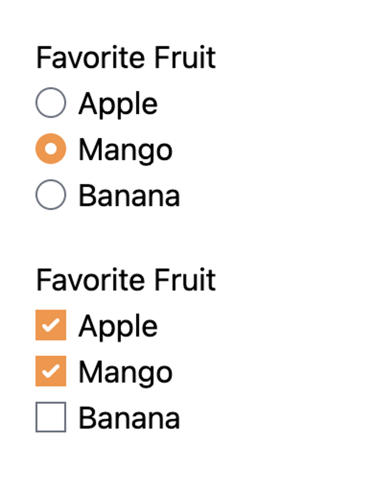
ARIA Attributes - Radio
<div role="group" aria-labelledby="fruit-heading">
  <h3 id="fruit-heading">Favorite Fruit</h3>
  <div>
    <input type="radio" name="fruit" id="apple" value="apple" />
    <label for="apple">Apple</label>
  </div>
  <div>
    <input type="radio" name="fruit" id="mango" value="mango" />
    <label for="mango">Mango</label>
  </div>
  <div>
    <input type="radio" name="fruit" id="banana" value="banana" />
    <label for="banana">Banana</label>
  </div>
</div>
ARIA attributes - checkbox
<div role="group" aria-labelledby="fruit-heading">
  <h3 id="fruit-heading">Favorite Fruit</h3>
  <div>
    <input type="checkbox" name="fruit" id="apple" value="apple" />
    <label for="apple">Apple</label>
  </div>
  <div>
    <input type="checkbox" name="fruit" id="mango" value="mango" />
    <label for="mango">Mango</label>
  </div>
  <div>
    <input type="checkbox" name="fruit" id="banana" value="banana" />
    <label for="banana">Banana</label>
  </div>
</div>
Fieldset element - radio
<fieldset>
  <legend>Favorite Fruit</legend>
  <div>
    <input type="radio" name="fruit" id="apple" value="apple" />
    <label for="apple">Apple</label>
  </div>
  <div>
    <input type="radio" name="fruit" id="mango" value="mango" />
    <label for="mango">Mango</label>
  </div>
  <div>
    <input type="radio" name="fruit" id="banana" value="banana" />
    <label for="banana">Banana</label>
  </div>
</fieldset>
Fieldset element - checkbox
<fieldset>
  <legend>Favorite Fruit</legend>
  <div>
    <input type="checkbox" name="fruit" id="apple" value="apple" />
    <label for="apple">Apple</label>
  </div>
  <div>
    <input type="checkbox" name="fruit" id="mango" value="mango" />
    <label for="mango">Mango</label>
  </div>
  <div>
    <input type="checkbox" name="fruit" id="banana" value="banana" />
    <label for="banana">Banana</label>
  </div>
</fieldset>
Styling elements using Tailwind CSS classes
When working with form elements, it is recommended to use Tailwind CSS Forms. This plugin resets default form styles and makes form elements easy to override with utilities. After installing this plugin, we can get to work with making the radio or checkbox element customized to suit our website’s needs.
Customize the colors of the input
To customize the default radio button checked value color, we can simply add a Tailwind text color utility to the input, e.g., text-pink-500. We can also customize the focus states to ensure that they are easily identified on the web page.
<fieldset class="px-5">
  <legend>Favorite Fruit</legend>
  <div class="flex items-center gap-1.5">
    <input type="radio" name="fruit" id="apple" class="text-orange-400 focus:ring-orange-600" value="apple" />
    <label for="apple">Apple</label>
  </div>
  <div class="flex items-center gap-1.5">
    <input type="radio" name="fruit" id="mango" class="text-orange-400 focus:ring-orange-600" value="mango" />
    <label for="mango">Mango</label>
  </div>
  <div class="flex items-center gap-1.5">
<input type="radio" name="fruit" id="banana" class="text-orange-400 focus:ring-orange-600" value="banana" />
    <label for="banana">Mango</label>
  </div>
</fieldset>

<fieldset class="px-5">
  <legend>Favorite Fruit</legend>
  <div class="flex items-center gap-1.5">
    <input type="checkbox" name="fruit" id="apple" class="text-orange-400 focus:ring-orange-600" value="apple" />
    <label for="apple">Apple</label>
  </div>
  <div class="flex items-center gap-1.5">
    <input type="checkbox" name="fruit" id="mango" class="text-orange-400 focus:ring-orange-600" value="mango" />
    <label for="mango">Mango</label>
  </div>
  <div class="flex items-center gap-1.5">
    <input type="checkbox" name="fruit" id="banana" class="text-orange-400 focus:ring-orange-600" value="banana" />
    <label for="banana">Mango</label>
  </div>
</fieldset>
Hiding labels
We should always ensure that an input element is associated with a label element. The sr-only class can be used to visually hide the radio button label, while still making it accessible to screen readers.
<div>
  <input type="radio" name="customRadio" id="customRadio" value="customRadio" class="sr-only" />
  <label for="customRadio">Custom Radio</label>
</div>

<div>
  <input type="checkbox" name="custom" id="custom" value="custom" class="sr-only" />
  <label for="custom">Custom Option</label>
</div>
Custom radio or checkbox design
Sometimes, the design of the website requires us to change the default browser look of the radio and checkbox elements. This can be accomplished by styling the label element and hiding the input element.
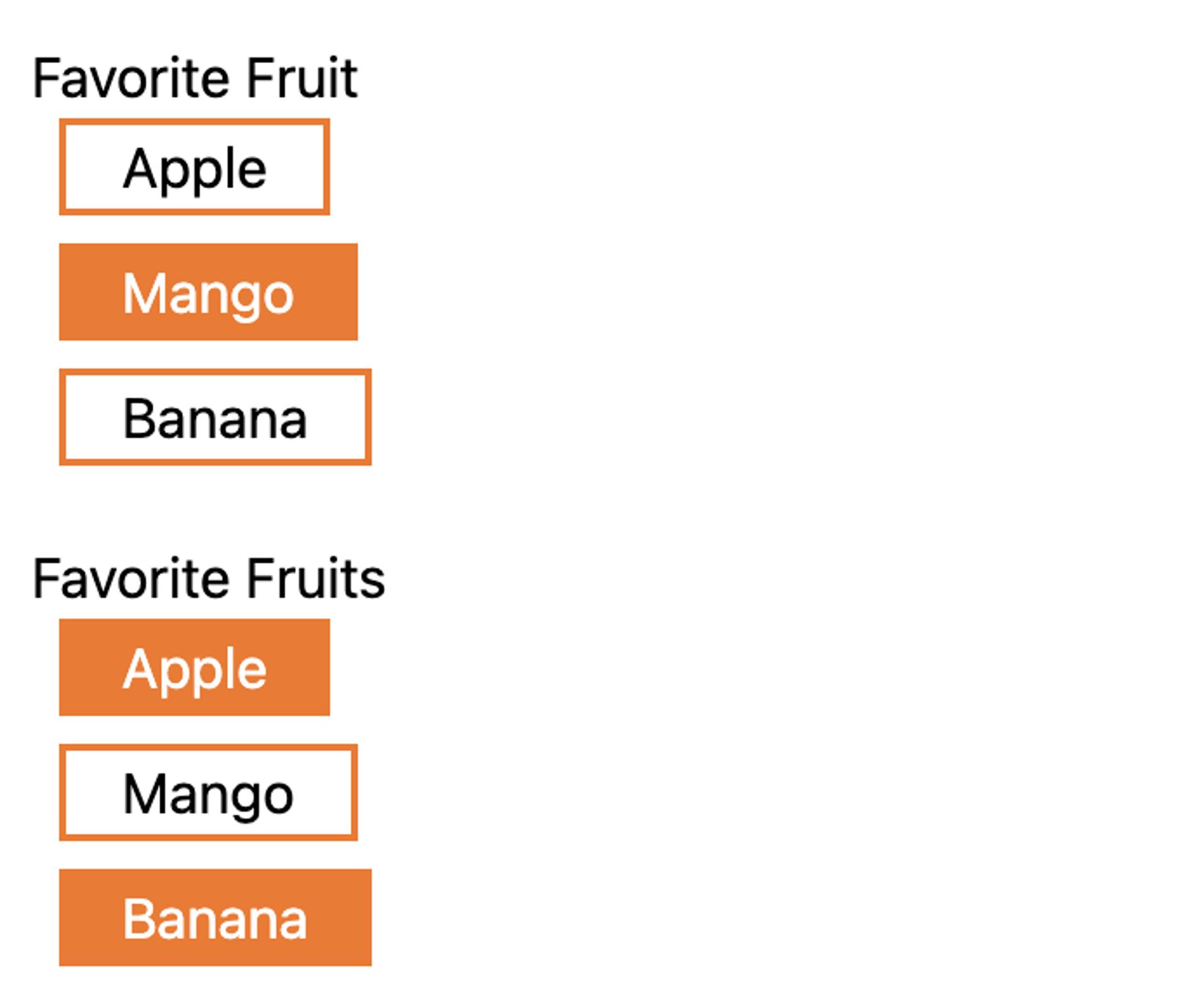
<fieldset class="mt-5 px-5">
  <legend>Favorite Fruit</legend>
  <div class="flex flex-col gap-2">
    <div class="flex items-center gap-1.5">
      <input type="radio" name="fruit" id="apple" class="peer h-0 w-0 opacity-0 focus:outline-none" value="apple" />
      <label for="apple" class="cursor-pointer border-2 border-orange-500 px-4 peer-checked:bg-orange-500 peer-checked:text-white peer-focus-visible:ring peer-focus-visible:ring-orange-700 peer-focus-visible:ring-offset-2"> Apple </label>
    </div>
    <div class="flex items-center gap-1.5">
      <input type="radio" name="fruit" id="mango" class="peer h-0 w-0 opacity-0 focus:outline-none" value="mango" />
      <label for="mango" class="cursor-pointer border-2 border-orange-500 px-4 peer-checked:bg-orange-500 peer-checked:text-white peer-focus-visible:ring peer-focus-visible:ring-orange-700 peer-focus-visible:ring-offset-2">Mango</label>
    </div>
    <div class="flex items-center gap-1.5">
      <input type="radio" name="fruit" id="banana" class="peer h-0 w-0 opacity-0 focus:outline-none" value="banana" />
      <label for="banana" class="cursor-pointer border-2 border-orange-500 px-4 peer-checked:bg-orange-500 peer-checked:text-white peer-focus-visible:ring peer-focus-visible:ring-orange-700 peer-focus-visible:ring-offset-2">Banana</label>
    </div>
  </div>
</fieldset>

<fieldset class="mt-5 px-5">
  <legend>Favorite Fruits</legend>
  <div class="flex flex-col gap-2">
    <div class="flex items-center gap-1.5">
      <input type="checkbox" name="fruit" id="apple_checkbox" class="peer h-0 w-0 opacity-0 focus:outline-none" value="apple" />
      <label for="apple_checkbox" class="cursor-pointer border-2 border-orange-500 px-4 peer-checked:bg-orange-500 peer-checked:text-white peer-focus-visible:ring peer-focus-visible:ring-orange-700 peer-focus-visible:ring-offset-2"> Apple </label>
    </div>
    <div class="flex items-center gap-1.5">
      <input type="checkbox" name="fruit" id="mango_checkbox" class="peer h-0 w-0 opacity-0 focus:outline-none" value="mango" />
      <label for="mango_checkbox" class="cursor-pointer border-2 border-orange-500 px-4 peer-checked:bg-orange-500 peer-checked:text-white peer-focus-visible:ring peer-focus-visible:ring-orange-700 peer-focus-visible:ring-offset-2">Mango</label>
    </div>
    <div class="flex items-center gap-1.5">
      <input type="checkbox" name="fruit" id="banana_checkbox" class="peer h-0 w-0 opacity-0 focus:outline-none" value="banana" />
      <label for="banana_checkbox" class="cursor-pointer border-2 border-orange-500 px-4 peer-checked:bg-orange-500 peer-checked:text-white peer-focus-visible:ring peer-focus-visible:ring-orange-700 peer-focus-visible:ring-offset-2">Banana</label>
    </div>
  </div>
</fieldset>
Test your radio and checkbox buttons
Once you've created your custom radio or checkbox buttons, it's important to test them to ensure that they are accessible to all users. You can use tools such as screen readers and keyboard-only navigation to test the accessibility of your input. You can also use automated testing tools, such as the WAVE Accessibility Tool, to check for accessibility issues on your website.
By using semantic HTML, ARIA attributes, and CSS, you can create radio or checkbox buttons that are both visually appealing and accessible to all users, including those who use assistive technologies.
Looking for a web development partner? Zaengle is the preferred development team for a number of businesses and organizations, large and small. We'd love to connect and see how we can help you.

Engineer
Jasmine has a background in software testing and she loves going on adventures, reading books, watching murder mysteries and doing jigsaw puzzles.